
Showing posts with label G324 Planning print productions. Show all posts
Showing posts with label G324 Planning print productions. Show all posts
Monday, 21 March 2011
Tuesday, 8 February 2011
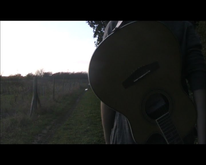
Looking at promotion images for bands

Looking at a recent album release. White Lies released their second studio album "Ritual". The band were promoted by UK tycoon music Store HMV.
Promotion pictures such as these are a great way of promoting new albums or smaller/breakthrough acts.
With the White Lies image (Right) shows a London store giving details to the fact the band are playing live to promote the new album. The main feature of the image is that of the actual band. It also features the front panel of the digi-pak to market the product.
As the image is copyrighted the HMV logo and slogan also appear on the poster as to.
Chosen artist title font

Above is the font I have chosen to use for the artist title for the digi-pak. Despite all of the fonts I had looked into and put forward as ideas, I have decided to use the Edition font which, along with the others, were collected from http://www.dafont.com/.
I have chosen this font because of it's simplicity.
The simple design of the font makes it easy to read and clear. I would consider editing this title futher, possibly with a change of colour. maybe that of being red, which would relate to the artists red ribbon on her guitar.
Possible Idea's regarding artist title (Digi-Pak)
These are some of the fonts I have chosen as a possiblity for my the artists name. This artist title will feature on the Front panel of the digipaks we are designing. As of yet these are the un-edited forms as I don't know whether black will be suitable for the front panel.

Hadley font

Edition font

Carrington font

Calligraphy Unicase font

Branching Mouse font

Hadley font

Edition font

Carrington font

Calligraphy Unicase font

Branching Mouse font
Monday, 7 February 2011
www.dafont.com
http://www.dafont.com/
dafont is site which allows people of uploaded designed fonts by themselves, for anyone to then use and access for there own personal use. This is a great site for the creating text logo's or for getting a unique font. Therefore I will be using it for my digi-pak to write the artist name and name of the album which will be given to it.
Examples of the fonts used as ideas shall be uploaded onto my blog. Where I shall then analyze them before making a final desion on the final choice for my blog.
Looking into digi-pak fonts (Information)
When looking at album covers one key aspect of them is the titles. What makes the titles however is that of the font used to display the band name or group. For certain types of genres for instance there are often conventional fonts, with similarities with some artists/groups relating to which genre they belong to. Fonts often make up band logo’s which can then be edited to be unique and indifferent to others. This sort of distinction can reflect the artist/bands genre like with album artworks.
If the correct style of font isn’t used on the album cover it can affect how the looks. A downfall to album artwork designs is that of if a font is a innopropiate size or colour which the reciever won't be able to read it as it may conflict with the background colours, or the font is to bunched etc:. If this occurs it can have a poor effect on the record. Positioning of the font is also crucial as it to can damage the main image panel.
If the correct style of font isn’t used on the album cover it can affect how the looks. A downfall to album artwork designs is that of if a font is a innopropiate size or colour which the reciever won't be able to read it as it may conflict with the background colours, or the font is to bunched etc:. If this occurs it can have a poor effect on the record. Positioning of the font is also crucial as it to can damage the main image panel.
Friday, 4 February 2011
Looking at fonts on album covers (Folk genre)
 The font for the album cover 'Baptism' by Joan Baez is a great example for looking into fonts used by certain artists of the folk genre, considering she is regarded as insperational artist by 'Mayenna Plastow-Smed', that artist I have created the music video for. The font for this album cover appears to be rather free-flowing which relates to the relaxed approach with the genre. Rumoured to be her signiture once, the font was created by a local artist that Baez knew. Despite looking free-flowing, in a way the black font also quite feminane, something which is often used by female artists of any genre. The black font on the beige canvas colour implies an artistic form/style that could relate to the genre.
Wednesday, 26 January 2011
Last Shadow Puppets-"The Age Of The Understatement"
 Looking at the album artwork cover by indie two-piece The Last Shadow Puppets for their debut "The Age Of The Undersatement", the band have used a photography image of a female. Despite lacking much going on within the image, this image has a sense of elegence and beauty about it. This could through the the use of the editing techniques. The black and white gives the image a sophisticated look. Which is believed to be what the band are looking for when selling their record.
 In a way the woman in this image is portrayed to be 'sexy' one way in which artists sell their records, this often occurs with solo females artists belonging to diffrent genres.
Monday, 17 January 2011
Michelle Tourtilloutts

This acrylic paining by artist Michelle Tourtilloutts gives a european style impreesion on farmlands. Based on the image "Tuscany Barn at Twilight" the colours of this asbstract image capture the rural aspect of europe. This image would tie in as insperation to use as a digi-pak cover or panel.
The use of colour in this image gives an insight to the use of light within an image.
Sunday, 16 January 2011
The idea of landscapes.

The autumnal leaves setting was used to full effect in my music video, so it would possibly be a decent idea to have a similar setting to this image used as a panel for the digi-pak. This relates to the entire aspect of folk genre, through the idea of the elements and seasons.

The pathway leading to the into the horizon is a nice idea. Considering the fact that parts of the music video were shot in scenic forests such as this. Therefore it could also be another a possible digi-pak image.
Considering there are some nice woodlands around the Norwich area it would possible to capture some nice shots.

The main focus of the picture is the tree and the element of natural lighting. Possibly getting shots
which capture the aspects lighting would be good as it could give a representation of pureness which the artist produces.

Saturday, 15 January 2011
John Sell Cotman Imagery

These 3 images are paintings done by artist John Sell Cotmann. These are his interpretations on aspects of certain in the British countryside.
This image gives a visual representation to that of the picturesque landscapes that Britain has to offer. The landscape show through the crafts of Cotman are that mellow depicting each image which a variation of light.
Cultural aspects shown in this image are those of the horse and carriage. The use of the greens in this image so the flourishing of the fresh grass.

The windmill image is being used for inspiration as it would be a possible location to do some photography. This would be a nice location to use as it has strong links to the aspect of the folk genre.
Images such as windmills or barn give a collective representation of the genre as a whole, as the buildings have a significant cultural representation to those in folk land.

The Mousehold Heath image here is a great image that gives a visual representation of the British countryside. This image by Cotman depicts the landscape as a Utopia in some aspects, with it's blue skies and green grass sprouting. The winding path leading into the distance is that symbol of hope as it leads into the horizon.
This image relates to the folk genre as the image is tranquil and peaceful, like the typical folk acoustic record is.
Tuesday, 11 January 2011
Joan Baez Artwork

Joan Baez - "Baptism"
When looking at the design of this album cover of Joan Baez shows many aspects that relate to genre of folk. This is shown through the inplication of a drawn image of the artist coming out of the tree, her hair represented as the structured branches. The small image of the artist at the top left of the could represent the idea of the artist's youth, again with the relation to nature or elements through the held flower. The youger image used could also relate the album title, that being "Baptism". The colours used for the album cover are simplistic, consisting of a beige background, the use of black. The green and pink used in the image represent the the colours of nature and youth. - "One Day At A Time"

This album cover of Joan Baez in contrast to that one of her releases above is a simple image that had been taken of the artist. It was then edited with the dampening of the saturation. The dull saturation could possibly relate to the idea of of slowness. The graining effect used shows the image could be aging which could possibly relate to the album title. The main focus in this image is that of the artist, a prodominate figure that takes almost all of the image. A centre of attention.
Laura Marling Artwork
 Laura Marling - "Alas I Cannot Swim" (2008)
The album artwork to the left, that of Laura Marling consists of many diffrent and vibrant images. Leaves and and insects used as drawn imagery which relates to the idea of nature. An aspect of folk. The colours used in the artwork are very summery, which in a way relates to her upbeat folk songs.
 Laura Marling - "I Speak Because I Can" (2010)
In contrast to that of her 2008 debut release, it was considered that Laura Malring took a more muture approach to the folk genre. This is identified through the album artwork. The frilly top is the only clear link to her genre as it loose and free flowing like the genre. As to is the use of colours around the artist title. The artist is the main focus of the album cover. The use of black and white gives the the cover a sophisticated look, which bodes well with what the artist was trying to put across in her new progression in her recordings.
Bob Dylan Artwork
 Bob Dylan -"Bob Dylan" (1962)
The debut album from folk great Bob Dylan is a trademark of what the genre is about. The cover features a dominante figure image of the performing artist. Also the acousic guitar gives an insight into what genre the artist performs as it is heavily related to folk.
 Bob Dylan - "Nashville Skyline" (1969)
Like the album cover above, the centre piece is that again of the artist. Like one of his previous album covers above.
The location of this album cover is a key element of this photographic image. It was taken in Nashville, Tennessee which is an iconic city, inspired by both the folk and rock genre. The title of the album is obviously related the location of this shot.
Again the genre is established through the capture of the guitar in the image.
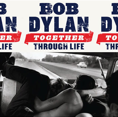
One of Bob Dylan's most recent works, with a few re-releases. The album artwork is that of a a black and white photoghraph rumoured to be that of an edited image of Dylan. The font is set out like an American Petrol company sign to present the artists nationalism, a somewhat patriotic symbol.
Wednesday, 5 January 2011
Concepts surrounding folk artists album covers (Basics)
Often with album covers by artists that feature in the folk/ indie-folk genre consist of certain designs and aspects surrounding the genre.
With a lot of older artists such as 'Joan Baez', album covers would consist of a simple design. This would of just feature the artist as the main focus, covering the majority of the front panel. Other panels would also have a simple design often being left blank as they featured the track listings and/or album production information.
In contrast to this more recent folk artists such as KT Tunstall have drawn insperation form this basic design images and have had them edited with the adjustment of light editing etc:
The idea of elements are often used by folk artists, often that of natural elements. Often those that are used those such as landscapes, rural or woodland. Pituresque images are used to show the genre of music played the artist.
The most common colours used on folk artists are:
-Black
-Brown
-Red
-Green
-Beige
-Yellow
-Orange
Computer editing effects are used to change the contrast of light and super-impose other images onto the cover. This often done for most recent folk artists. This can give the effect of built up images, or other effects that are created.
Thursday, 4 November 2010
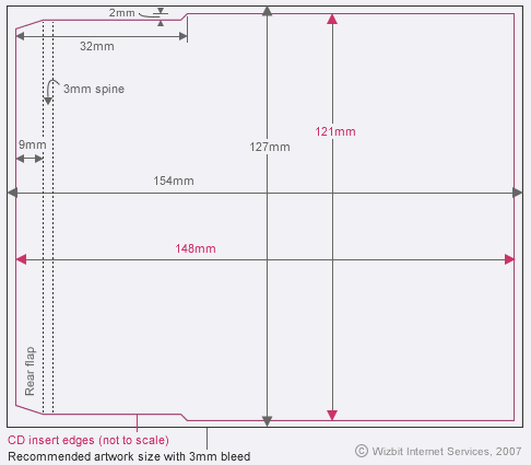
Digi-pack
The definition of the term"digi-pack" is that of a casing used for cd's. It also includes the the artist and album titles, and an image often relating to the artist/band. This image is usually a logo or text. The digi-pack will also include track listings, track length and credits.
Below is the reccomended digi-pak net .
.
It it shows the required measurements for the design of any CD case and print productions.
In all digi-paks all posssible panels are covered, this includes the flaps.
Front panel
which is used to ad vertise the artist/band by having an image of them, the bands logo or artists name. Also the album title should there be one.
Back panel
Often on this panel the designers put the track listings as well as the referencing to the copyrights. Barcodes are also found on the back of the case. As to is the record company logo to whom the artist/band is signed to.
Front Flap
Consists of having the CD reference number, the album title and again artist name.
Back Flap
Like the front flap, it consists of simular information
Below is the reccomended digi-pak net
 .
.It it shows the required measurements for the design of any CD case and print productions.
In all digi-paks all posssible panels are covered, this includes the flaps.
Front panel
which is used to ad
Back panel
Often on this panel the designers put the track listings as well as the referencing to the copyrights. Barcodes are also found on the back of the case. As to is the record company logo to whom the artist/band is signed to.
Front Flap
Consists of having the CD reference number, the album title and again artist name.
Back Flap
Like the front flap, it consists of simular information
Thursday, 8 July 2010
Subscribe to:
Posts (Atom)