 Front Panel
 This is the front cover for the digi-pak. The main feature of this image is that of the artist as the main focus, to show her in a positive light and give a basic insight for as to what her music is like. This portrayed from the background imagery of the forrest, which is commonly related to the folk/country genre. The white font used in the image is clear to read and writtten in a trendy yet feminene style. The slightly smaller writing is that of the album/E.P title, which like the artist name stands out.
 Inside Panel (Right)
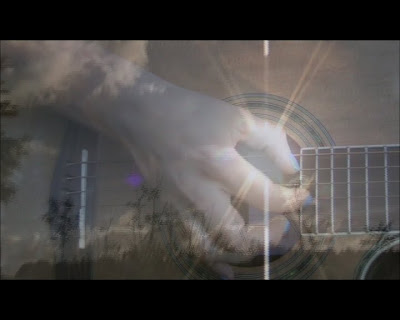
 The insert panel which is the image behind the disc, is taken from the music video itself. It was taken during a transition between a cross-fade of a the sun and guitar close-up. This works well as an image as it captures folk aspects through the concept of nature and the instrument.
 Inside Panel (Left)
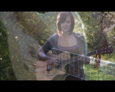
 Again taken from the music video, this image shows the idea of performance, something which the artist is keen upon. Like the other inside image, it to is a transtion that wasn't edited at all.
Back Panel
 Front Panel This is the front cover for the digi-pak. The main feature of this image is that of the artist as the main focus, to show her in a positive light and give a basic insight for as to what her music is like. This portrayed from the background imagery of the forrest, which is commonly related to the folk/country genre. The white font used in the image is clear to read and writtten in a trendy yet feminene style. The slightly smaller writing is that of the album/E.P title, which like the artist name stands out.
  Inside Panel (Right) The insert panel which is the image behind the disc, is taken from the music video itself. It was taken during a transition between a cross-fade of a the sun and guitar close-up. This works well as an image as it captures folk aspects through the concept of nature and the instrument.
  Inside Panel (Left) Again taken from the music video, this image shows the idea of performance, something which the artist is keen upon. Like the other inside image, it to is a transtion that wasn't edited at all. Back Panel


