Thursday 7 April 2011
Evaluation Question 3
3) What have you learned from your media research? For our audience we had created sheets filled out. These sheets allow the audience to give opinions and score on a rating system for an overall mark they would give the productions. The participants of this feedback write their age and sex, so that demographics can be identified. All sheets collected are anonymous however. Since the video was uploaded onto the video sharing site http://www.youtube.com/ it has had one comment from the artist herself, commenting on how she enjoyed the video. A link to the video is http://www.youtube.com/watch?v=12mSPPLw0v4. The audience feedback conducted has been taken from the foundation media students who have given their opinions and rated my production piece. They completed sheets for the music video and created print productions. For the music video, the students (aged 16-17) of both sexes (4 Male, 2 Female) rated the video. Within the male demographic their was a similar pattern in how they rated it, usally marking 2-4. The marksheets ratings range from 1 (worst) to 5 (best). They believe that the music video was at the correct length. There was nothing that could upset in my production, this was highlighted by the fact that all participants in feedback responded 'no' to the question "Were there any aspects that you found offensive?". However they did highlight the fact that there was trouble with the sound quality of the track. This wasn't my fault. The artist did attempt to re-record the song, however this turned out to be just as poor in quality as the original mp3 file. The foundation students were asked to point out an aspect of the footage that they highly rated as the best part of the production. Parts mentioned were the utilisation of the location, the fact the music video has a stable set path, the use of camerawork
Evaluation Question 4
4) How did you use media technologies in the construction and research, planning and Evaluation stages? Since the beginning of the study of the subject, we have been introduced into a new way of recording work. Instead of writing wording onto a conventional piece of paper, we’ve typed our notes and research onto http://www.blogger.com a site which is usually used for blogging. All notes for research are input into this site and saved. It contributes to our overall coursework marks. These blogs allow teachers to comment on the posts that have been created and can then be edited by the user. These posts can also be edited at anytime during the year. When researching the internet as a whole has been a beneficial factor in itself, proving to be the main aid when looking into certain aspects of the project. When looking for a band to create a video for a numerous amount of sights were looked into, however after separating from a group I decided to chose a reliable artist. When looking into the artist’s genre I used sources that linked to related artists and artist’s whom my artist (Mayenna Plastow-Smed) aspired to. Using the site Youtube was great for looking at similar artist’s music video’s before analyzing them, pointing out key features that the genre of Folk had when influencing video’s. When looking into genre, the internet offered information about certain festivals which have help progress the genre. One example of a festival would be “Newport festival” which discovered many significant folk artists, a prime example being ‘Joan Baez’ who at the time was support to ‘Bob Dylan’. Clips from Youtube enabled me to gain a better understanding of what music videos utilise within the genre. Main aspects include performance based shots those mainly being close-ups, the idea of nature with scenic landscapes. All clips I have used on my blog were taken from http://www.youtube.com/ . Drafts and sketches of possible ideas from storyboarding for instance are scanned onto our blogs to assist with our planning by uploading the scanned images to our blogs. When shooting the raw footage for our projects we used Nikon digital cameras. These enabled us to first capture the motion before reviewing it on the screen to see if a suitable sequence of footage had come out well. Tri-pods used for the camera enabled us to capture a smoother image and capture different angled shots to give variation to the footage itself. Once all footage had been shot, it came down to the edit. The editing was done on the program ‘Adobe Premiere Elements’. This software allowed us to upload the footage and organise it into a suitable narrative structure that related to the original, drawn-up plans. This program allowed us to use many effects that were offered to edit our videos. These included a host of transitions that made the video more interesting. Transitions used included ‘fade to black’ and ‘cross-dissolve’. Fonts from the internet site http://www.dafont.com/ to find a suitable font for the digi-pak that had to be created from scratch. Screenshots from my created music video were used as 4 panels. These were edited on Photoshop, an image editing program. Fonts can easily be added to impose effects on the image. The images I used for the panels were edited with a simple effect, which was the change of light contrast and brightness. Ideas for my print productions came from research into similar artists front covers, looking into what the main features were. From the research I could deliberate what aspects feature often. These include the artist as the main focus, aspects of folk (drawing/sketches), wildlife/ nature. Which I believe has been captured in my images. When creating the promotion poster I looked into how acts are advertised within certain magazines. Despite mainstream magazines like the ‘NME’ promoting more common artists, they occasional feature small, unsigned artists. When producing a poster is key that the artist is the main feature of the image, a centre piece for what is their promotion image. Inspiration for my poster came from using a design like this. Using the artist as the main image with a supporting image of the front panel digi-pak cover so that the album artwork is recognisable to the audience for whom it may appeal to ("the ideal audience").
Evaluation Question 2
2) How effective is the combination of your main product with ancillary texts?
Digi-pak Below is the 4 set images for the digi-pak for my artist Mayenna Plastow-Smed.
In correspondence to the genre I would say it is an ideal representation on the modern aspect of the genre. These images where taken from the music video itself to create the four necessary panels needed to create a full digi-pak. These images have been selected out of many other diffrent screenshots that I had taken. As I was actually asked by the artist to create a digi-pak centred around her, thus it was important to capture the best images that both represented her and her genre of music.
 Front Panel
 The artist is the main focus of this image. The only altercartions that occured in this screenshot was that of the 2 rose, paintbrush effect which overlay each other. 2 Diffrent fonts were used for the front panel which were both edited to be white, so that they stand out from the main image of the artist revealing herself from behind a tree, which creates connotations of shyness. This shyness can relate her singing style and in a sense her lyrics. The use of the landscape of woodland relates heavily with the folk genre, so it was therefore essential to feature.
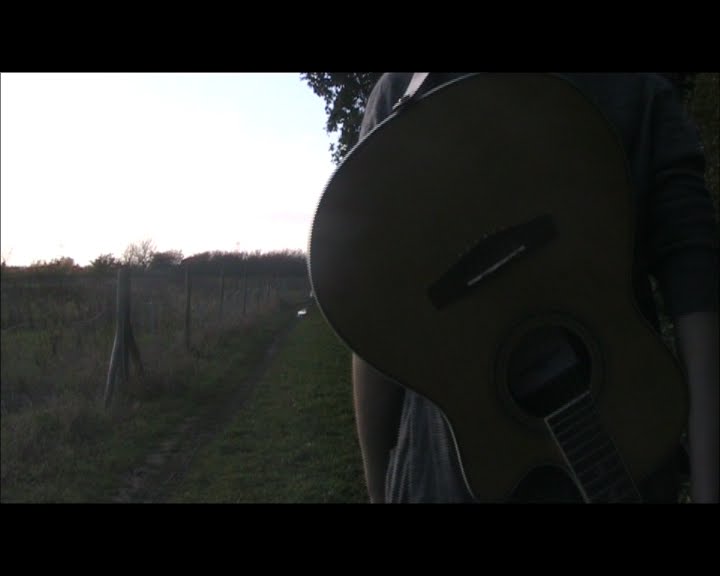
Again features a main image of the artist, however this screenshot was taken during a transition in the music video which has somewhat created an image of illusion. The image features the artist walking down a  stretch of country pathway merged with an image of a guitar overlaying. An overall pretty image which had minor editing done to it in Photoshop. The only tweaks made were those of the change of contrast and brightness which boosted the
vibrancy of the image.
Inside Panel (Right)
More commonly referred to as the 'CD panel'. Another cross-fade screenshot was used to show aspects of the artist's genre. This cross-fade image has a close-up image of the artist's acoustic guitar which is a symbolic instrument to the folk genre. However in this image the transition captures the sunlight bursting through the guitar box. Like with the other inside panel, the images contrast has been edited to brighten the sunshine in the image.
 Back Panel
Considering this is the back panel, I thought it would be a good idea to use the last image in my music video. A stunning image of the artist walking away from the camera. The image was edited with the contarst and brightness to raise the light levels from the sunset in the image. Text in a stylish, feminane font has been used for to relate to the possible target audience which is highly likely to be a female audience. It also features a false company logo to make the complete digi-pak look authentic. The logo was created in photoplus before being transferred to photoshop. The text of record releasing details have been put into a small font at the bottom of the image to tell of trademarks and company information.
Evalution Question 1
In what ways does your media product use, develop or challenge forms and conventions or real media products?
The music video that I have created for A2 level is that for a indie-folk artist who happens to be a friend of mine. In order to help promote her as an artist I helped create a music video for her, as part of the subject. As an add on to this, print productions for a digi-pak also had to be created. Seeing as the genre the video is being designed for is that of indie-folk genre it was important to capture aspects of the countryside that relate to the roots of the genre. This had come from extensive research into the genre itself and looking at related artists that feature under the genre. Other texts where found on sites such as Youtube, to collect a certain amount of clips that helped me develop a better understanding of the genre as well as conducting research on similar artist that inspire the artist. With these clips I was able to research into the shot types used in the folk artist's videos gaining an insight into how connotations are made, costume idea's, narratives and mise-en-scene. looking into certain events such as the 'Newport Festival' to gain an insight into how artists were generally discovered in the genre within the genre. Folk artists morals are often portrayed through there music and lyrics, I learnt this from through the genre research and research into similar texts. I don't believe I have challenged any conventions of the genre, however I believe that with this music video it has given a new take on the genre like artists such as KT Tunstall and Ellie Goulding have. As for the print productions which were created after the video had been fully edited is indifferent as the images used have be taken from the finished production piece itself. Editing printscreen shots in Photoshop to create a more distinctive image, using a range of effects that improve the image dramatically. I had planned out the digi-pak as rough sketches to start with, however over a couple of weeks the idea's grew in creativity. Idea's were developed from looking at other relevant artists that are similar. Looking at the editing techniques used in on the covers as well as information that is provided on the case. Analysing digi-pak images was a major part of the research I conducted, it gave an insight into what colours to use, fonts and what sort of images to use. For example, for the front panel (cover) I used an image of the artist which is common with the folk genre. When researching into the panels I collected album artworks of folk artists from looking on http://www.google.co.uk/imghp?hl=en&tab=wi (Google Images). Artist
The music video that I have created for A2 level is that for a indie-folk artist who happens to be a friend of mine. In order to help promote her as an artist I helped create a music video for her, as part of the subject. As an add on to this, print productions for a digi-pak also had to be created. Seeing as the genre the video is being designed for is that of indie-folk genre it was important to capture aspects of the countryside that relate to the roots of the genre. This had come from extensive research into the genre itself and looking at related artists that feature under the genre. Other texts where found on sites such as Youtube, to collect a certain amount of clips that helped me develop a better understanding of the genre as well as conducting research on similar artist that inspire the artist. With these clips I was able to research into the shot types used in the folk artist's videos gaining an insight into how connotations are made, costume idea's, narratives and mise-en-scene. looking into certain events such as the 'Newport Festival' to gain an insight into how artists were generally discovered in the genre within the genre. Folk artists morals are often portrayed through there music and lyrics, I learnt this from through the genre research and research into similar texts. I don't believe I have challenged any conventions of the genre, however I believe that with this music video it has given a new take on the genre like artists such as KT Tunstall and Ellie Goulding have. As for the print productions which were created after the video had been fully edited is indifferent as the images used have be taken from the finished production piece itself. Editing printscreen shots in Photoshop to create a more distinctive image, using a range of effects that improve the image dramatically. I had planned out the digi-pak as rough sketches to start with, however over a couple of weeks the idea's grew in creativity. Idea's were developed from looking at other relevant artists that are similar. Looking at the editing techniques used in on the covers as well as information that is provided on the case. Analysing digi-pak images was a major part of the research I conducted, it gave an insight into what colours to use, fonts and what sort of images to use. For example, for the front panel (cover) I used an image of the artist which is common with the folk genre. When researching into the panels I collected album artworks of folk artists from looking on http://www.google.co.uk/imghp?hl=en&tab=wi (Google Images). Artist
Monday 21 March 2011

Tuesday 1 March 2011
EVALUATION!
In what ways does your media product use, develop or challenge forms and conventions or real media products? The music video that I have created for A2 level is that for a indie-folk artist who happens to be a friend of mine. In order to help promote her as an artist I helped create a music video for her, as part of the subject. As an add on to this, print productions for a digi-pak also had to be created. Seeing as the genre the video is being designed for is that of indie-folk genre it was important to capture aspects of the countryside that relate to the roots of the genre. This had come from extensive research into the genre itself and looking at related artists that feature under the genre. Other texts where found on sites such as Youtube, to collect a certain amount of clips that helped me develop a better understanding of the genre as well as conducting research on similar artist that inspire the artist. With these clips I was able to research into the shot types used in the folk artist's videos gaining an insight into how connotations are made, costume idea's, narratives and mise-en-scene. looking into certain events such as the 'Newport Festival' to gain an insight into how artists were generally discovered in the genre within the genre. Folk artists morals are often portrayed through there music and lyrics, I learnt this from through the genre research and research into similar texts. I don't believe I have challenged any conventions of the genre, however I believe that with this music video it has given a new take on the genre like artists such as KT Tunstall and Ellie Goulding have. As for the print productions which were created after the video had been fully edited is indifferent as the images used have be taken from the finished production piece itself. Editing printscreen shots in Photoshop to create a more distinctive image, using a range of effects that improve the image dramatically. I had planned out the digi-pak as rough sketches to start with, however over a couple of weeks the idea's grew in creativity. Idea's were developed from looking at other relevant artists that are similar. Looking at the editing techniques used in on the covers as well as information that is provided on the case. analysing digi-pak images was a major part of the research i conducted, it gave an insight into what colours to use, fonts and what sort of images to use. For example, for the front panel (cover) I used an image of the artist which is common with the folk genre. 2) How effective is the combination of your main product with ancillary texts? Digi-pak Below is the 4 set images for the digi-pak for my artist Mayenna Plastow-Smed. (Insert Images) In correspondence to the genre I would say it is an ideal representation on the modern aspect of the genre. These images where taken from the music video itself to create the four necessary panels needed to create a full digi-pak. These images have been selected out of many other diffrent screenshots that I had taken. As I was actually asked by the artist to create a digi-pak centred around her, thus it was important to capture the best images that both represented her and her genre of music. Front Panel The artist is the main focus of this image. The only altercartions that occured in this screenshot was that of the 2 rose, paintbrush effect which overlay each other. 2 Diffrent fonts were used for the front panel which were both edited to be white, so that they stand out from the main image of the artist revealing herself from behind a tree, which creates connotations of shyness. This shyness can relate her singing style and in a sense her lyrics. The use of the landscape of woodland relates heavily with the folk genre, so it was therefore essential to feature. Inside Panel (Left) Again features a main image of the artist, however this screenshot was taken during a transition in the music video which has somewhat created an image of illusion. The image features the artist walking down a stretch of country pathway merged with an image of a guitar overlaying. An overall pretty image which had minor editing done to it in Photoshop. The only tweaks made were those of the change of contrast and brightness which boosted the vibrancy of the image. Inside Panel (Right) More commonly referred to as the 'CD panel'. Another cross-fade screenshot was used to show aspects of the artist's genre. This cross-fade image has a close-up image of the artist's acoustic guitar which is a symbolic instrument to the folk genre. However in this image the transition captures the sunlight bursting through the guitar box. Like with the other inside panel, the images contrast has been edited to brighten the sunshine in the image. Back Panel Considering this is the back panel, I thought it would be a good idea to use the last image in my music video. A stunning image of the artist walking away from the camera. The image was edited with the contarst and brightness to raise the light levels from the sunset in the image. Text in a stylish, feminane font has been used for to relate to the possible target audience which is highly likely to be a female audience. It also features a false company logo to make the complete digi-pak look authentic. The logo was created in photoplus before being transferred to photoshop. The text of record releasing details have been put into a small font at the bottom of the image to tell of trademarks and company information. 4) How did you use media technologies in the construction and research, planning and Evaluation stages? Since the beginning of the study of the subject, we have been introduced into a new way of recording work. Instead of writing wording onto a conventional piece of paper, we’ve typed our notes and research onto http://www.blogger.com a site which is usually used for blogging. All notes for research are input into this site and saved. It contributes to our overall coursework marks. These blogs allow teachers to comment on the posts that have been created and can then be edited by the user. These posts can also be edited at anytime during the year. When researching the internet as a whole has been a beneficial factor in itself, proving to be the main aid when looking into certain aspects of the project. When looking for a band to create a video for a numerous amount of sights were looked into, however after separating from a group I decided to chose a reliable artist. When looking into the artist’s genre I used sources that linked to related artists and artist’s whom my artist (Mayenna Plastow-Smed) aspired to. Using the site Youtube was great for looking at similar artist’s music video’s before analyzing them, pointing out key features that the genre of Folk had when influencing video’s. When looking into genre, the internet offered information about certain festivals which have help progress the genre. One example of a festival would be “Newport festival” which discovered many significant folk artists, a prime example being ‘Joan Baez’ who at the time was support to ‘Bob Dylan’. Clips from Youtube enabled me to gain a better understanding of what music videos utilise within the genre. Main aspects include performance based shots those mainly being close-ups, the idea of nature with scenic landscapes. All clips I have used on my blog were taken from http://www.youtube.com/ . Drafts and sketches of possible ideas from storyboarding for instance are scanned onto our blogs to assist with our planning by uploading the scanned images to our blogs. When shooting the raw footage for our projects we used Nikon digital cameras. These enabled us to first capture the motion before reviewing it on the screen to see if a suitable sequence of footage had come out well. Tri-pods used for the camera enabled us to capture a smoother image and capture different angled shots to give variation to the footage itself. Once all footage had been shot, it came down to the edit. The editing was done on the program ‘Adobe Premiere Elements’. This software allowed us to upload the footage and organise it into a suitable narrative structure that related to the original, drawn-up plans. This program allowed us to use many effects that were offered to edit our videos. These included a host of transitions that made the video more interesting. Transitions used included ‘fade to black’ and ‘cross-dissolve’. Fonts from the internet site http://www.dafont.com/ to find a suitable font for the digi-pak that had to be created from scratch. Screenshots from my created music video were used as 4 panels. These were edited on Photoshop, an image editing program. Fonts can easily be added to impose effects on the image. The images I used for the panels were edited with a simple effect, which was the change of light contrast and brightness. Ideas for my print productions came from research into similar artists front covers, looking into what the main features were. From the research I could deliberate what aspects feature often. These include the artist as the main focus, aspects of folk (drawing/sketches), wildlife/ nature. Which I believe has been captured in my images. When creating the promotion poster I looked into how acts are advertised within certain magazines. Despite mainstream magazines like the ‘NME’ promoting more common artists, they occasional feature small, unsigned artists. When producing a poster is key that the artist is the main feature of the image, a centre piece for what is their promotion image. Inspiration for my poster came from using a design like this, using the artist as the main image with a supporting image of the front digi-pak cover so that the album artwork is recognisable to the audience for whom it may appeal to. 3) What have you learned from your media research? For our audience we had created sheets filled out. These sheets allow the audience to give opinions and score on a rating system for an overall mark they would give the productions. The participants of this feedback write their age and sex, so that demographics can be identified. All sheets collected are anonymous however. Since the video was uploaded onto the video sharing site http://www.youtube.com/ it has had one comment from the artist herself, commenting on how she enjoyed the video. A link to the video is http://www.youtube.com/watch?v=12mSPPLw0v4 .
Wednesday 16 February 2011
Created Digi-Pak Panels
 Front Panel This is the front cover for the digi-pak. The main feature of this image is that of the artist as the main focus, to show her in a positive light and give a basic insight for as to what her music is like. This portrayed from the background imagery of the forrest, which is commonly related to the folk/country genre. The white font used in the image is clear to read and writtten in a trendy yet feminene style. The slightly smaller writing is that of the album/E.P title, which like the artist name stands out.
 Tuesday 8 February 2011
Looking at promotion images for bands

Looking at a recent album release. White Lies released their second studio album "Ritual". The band were promoted by UK tycoon music Store HMV.
Promotion pictures such as these are a great way of promoting new albums or smaller/breakthrough acts.
With the White Lies image (Right) shows a London store giving details to the fact the band are playing live to promote the new album. The main feature of the image is that of the actual band. It also features the front panel of the digi-pak to market the product.
As the image is copyrighted the HMV logo and slogan also appear on the poster as to.
Chosen artist title font

Above is the font I have chosen to use for the artist title for the digi-pak. Despite all of the fonts I had looked into and put forward as ideas, I have decided to use the Edition font which, along with the others, were collected from http://www.dafont.com/.
I have chosen this font because of it's simplicity.
The simple design of the font makes it easy to read and clear. I would consider editing this title futher, possibly with a change of colour. maybe that of being red, which would relate to the artists red ribbon on her guitar.
Possible Idea's regarding artist title (Digi-Pak)
These are some of the fonts I have chosen as a possiblity for my the artists name. This artist title will feature on the Front panel of the digipaks we are designing. As of yet these are the un-edited forms as I don't know whether black will be suitable for the front panel.

Hadley font

Edition font

Carrington font

Calligraphy Unicase font

Branching Mouse font

Hadley font

Edition font

Carrington font

Calligraphy Unicase font

Branching Mouse font
Monday 7 February 2011
www.dafont.com
http://www.dafont.com/
dafont is site which allows people of uploaded designed fonts by themselves, for anyone to then use and access for there own personal use. This is a great site for the creating text logo's or for getting a unique font. Therefore I will be using it for my digi-pak to write the artist name and name of the album which will be given to it.
Examples of the fonts used as ideas shall be uploaded onto my blog. Where I shall then analyze them before making a final desion on the final choice for my blog.
Looking into digi-pak fonts (Information)
When looking at album covers one key aspect of them is the titles. What makes the titles however is that of the font used to display the band name or group. For certain types of genres for instance there are often conventional fonts, with similarities with some artists/groups relating to which genre they belong to. Fonts often make up band logo’s which can then be edited to be unique and indifferent to others. This sort of distinction can reflect the artist/bands genre like with album artworks.
If the correct style of font isn’t used on the album cover it can affect how the looks. A downfall to album artwork designs is that of if a font is a innopropiate size or colour which the reciever won't be able to read it as it may conflict with the background colours, or the font is to bunched etc:. If this occurs it can have a poor effect on the record. Positioning of the font is also crucial as it to can damage the main image panel.
If the correct style of font isn’t used on the album cover it can affect how the looks. A downfall to album artwork designs is that of if a font is a innopropiate size or colour which the reciever won't be able to read it as it may conflict with the background colours, or the font is to bunched etc:. If this occurs it can have a poor effect on the record. Positioning of the font is also crucial as it to can damage the main image panel.
Friday 4 February 2011
Looking at fonts on album covers (Folk genre)
 The font for the album cover 'Baptism' by Joan Baez is a great example for looking into fonts used by certain artists of the folk genre, considering she is regarded as insperational artist by 'Mayenna Plastow-Smed', that artist I have created the music video for. The font for this album cover appears to be rather free-flowing which relates to the relaxed approach with the genre. Rumoured to be her signiture once, the font was created by a local artist that Baez knew. Despite looking free-flowing, in a way the black font also quite feminane, something which is often used by female artists of any genre. The black font on the beige canvas colour implies an artistic form/style that could relate to the genre.
Wednesday 26 January 2011
Last Shadow Puppets-"The Age Of The Understatement"
 Looking at the album artwork cover by indie two-piece The Last Shadow Puppets for their debut "The Age Of The Undersatement", the band have used a photography image of a female. Despite lacking much going on within the image, this image has a sense of elegence and beauty about it. This could through the the use of the editing techniques. The black and white gives the image a sophisticated look. Which is believed to be what the band are looking for when selling their record.
 In a way the woman in this image is portrayed to be 'sexy' one way in which artists sell their records, this often occurs with solo females artists belonging to diffrent genres.
Monday 17 January 2011
Michelle Tourtilloutts

This acrylic paining by artist Michelle Tourtilloutts gives a european style impreesion on farmlands. Based on the image "Tuscany Barn at Twilight" the colours of this asbstract image capture the rural aspect of europe. This image would tie in as insperation to use as a digi-pak cover or panel.
The use of colour in this image gives an insight to the use of light within an image.
Sunday 16 January 2011
The idea of landscapes.

The autumnal leaves setting was used to full effect in my music video, so it would possibly be a decent idea to have a similar setting to this image used as a panel for the digi-pak. This relates to the entire aspect of folk genre, through the idea of the elements and seasons.

The pathway leading to the into the horizon is a nice idea. Considering the fact that parts of the music video were shot in scenic forests such as this. Therefore it could also be another a possible digi-pak image.
Considering there are some nice woodlands around the Norwich area it would possible to capture some nice shots.

The main focus of the picture is the tree and the element of natural lighting. Possibly getting shots
which capture the aspects lighting would be good as it could give a representation of pureness which the artist produces.

Saturday 15 January 2011
John Sell Cotman Imagery

These 3 images are paintings done by artist John Sell Cotmann. These are his interpretations on aspects of certain in the British countryside.
This image gives a visual representation to that of the picturesque landscapes that Britain has to offer. The landscape show through the crafts of Cotman are that mellow depicting each image which a variation of light.
Cultural aspects shown in this image are those of the horse and carriage. The use of the greens in this image so the flourishing of the fresh grass.

The windmill image is being used for inspiration as it would be a possible location to do some photography. This would be a nice location to use as it has strong links to the aspect of the folk genre.
Images such as windmills or barn give a collective representation of the genre as a whole, as the buildings have a significant cultural representation to those in folk land.

The Mousehold Heath image here is a great image that gives a visual representation of the British countryside. This image by Cotman depicts the landscape as a Utopia in some aspects, with it's blue skies and green grass sprouting. The winding path leading into the distance is that symbol of hope as it leads into the horizon.
This image relates to the folk genre as the image is tranquil and peaceful, like the typical folk acoustic record is.
Tuesday 11 January 2011
Joan Baez Artwork

Joan Baez - "Baptism"
When looking at the design of this album cover of Joan Baez shows many aspects that relate to genre of folk. This is shown through the inplication of a drawn image of the artist coming out of the tree, her hair represented as the structured branches. The small image of the artist at the top left of the could represent the idea of the artist's youth, again with the relation to nature or elements through the held flower. The youger image used could also relate the album title, that being "Baptism". The colours used for the album cover are simplistic, consisting of a beige background, the use of black. The green and pink used in the image represent the the colours of nature and youth. - "One Day At A Time"

This album cover of Joan Baez in contrast to that one of her releases above is a simple image that had been taken of the artist. It was then edited with the dampening of the saturation. The dull saturation could possibly relate to the idea of of slowness. The graining effect used shows the image could be aging which could possibly relate to the album title. The main focus in this image is that of the artist, a prodominate figure that takes almost all of the image. A centre of attention.
Laura Marling Artwork
 Laura Marling - "Alas I Cannot Swim" (2008)
The album artwork to the left, that of Laura Marling consists of many diffrent and vibrant images. Leaves and and insects used as drawn imagery which relates to the idea of nature. An aspect of folk. The colours used in the artwork are very summery, which in a way relates to her upbeat folk songs.
 Laura Marling - "I Speak Because I Can" (2010)
In contrast to that of her 2008 debut release, it was considered that Laura Malring took a more muture approach to the folk genre. This is identified through the album artwork. The frilly top is the only clear link to her genre as it loose and free flowing like the genre. As to is the use of colours around the artist title. The artist is the main focus of the album cover. The use of black and white gives the the cover a sophisticated look, which bodes well with what the artist was trying to put across in her new progression in her recordings.
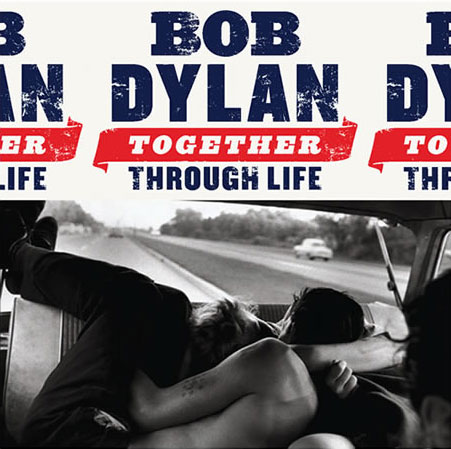
Bob Dylan Artwork
 Bob Dylan -"Bob Dylan" (1962)
The debut album from folk great Bob Dylan is a trademark of what the genre is about. The cover features a dominante figure image of the performing artist. Also the acousic guitar gives an insight into what genre the artist performs as it is heavily related to folk.
 Bob Dylan - "Nashville Skyline" (1969)
Like the album cover above, the centre piece is that again of the artist. Like one of his previous album covers above.
The location of this album cover is a key element of this photographic image. It was taken in Nashville, Tennessee which is an iconic city, inspired by both the folk and rock genre. The title of the album is obviously related the location of this shot.
Again the genre is established through the capture of the guitar in the image.
One of Bob Dylan's most recent works, with a few re-releases. The album artwork is that of a a black and white photoghraph rumoured to be that of an edited image of Dylan. The font is set out like an American Petrol company sign to present the artists nationalism, a somewhat patriotic symbol.
Thursday 6 January 2011
Looking at Live performance footage of Joan Baez
This live footage of folk singer Joan Baez perfoming in 1975. As she performs the camera is souly focused upon her. The artist somewhat creates the affect of a 'gaze' which draws the audiences focus towards her. This is what i will trying to achieve in some of the shots for my music video.
Wednesday 5 January 2011
Concepts surrounding folk artists album covers (Basics)
Often with album covers by artists that feature in the folk/ indie-folk genre consist of certain designs and aspects surrounding the genre.
With a lot of older artists such as 'Joan Baez', album covers would consist of a simple design. This would of just feature the artist as the main focus, covering the majority of the front panel. Other panels would also have a simple design often being left blank as they featured the track listings and/or album production information.
In contrast to this more recent folk artists such as KT Tunstall have drawn insperation form this basic design images and have had them edited with the adjustment of light editing etc:
The idea of elements are often used by folk artists, often that of natural elements. Often those that are used those such as landscapes, rural or woodland. Pituresque images are used to show the genre of music played the artist.
The most common colours used on folk artists are:
-Black
-Brown
-Red
-Green
-Beige
-Yellow
-Orange
Computer editing effects are used to change the contrast of light and super-impose other images onto the cover. This often done for most recent folk artists. This can give the effect of built up images, or other effects that are created.
Subscribe to:
Posts (Atom)